Back
Updated at: February 11, 2026
Accessibility in the Age of Glassmorphic UI:
Research Report and Evidence Base

This comprehensive research report provides detailed evidence, case studies, and expert analysis to enrich your article on glassmorphism and accessibility. The findings reveal significant challenges with the Liquid Glass aesthetic trend and its impact on digital accessibility compliance.
WCAG 2.2 Specific Requirements and Violations
Critical Success Criteria Affected by Glassmorphism
Success Criterion 1.4.3 (Contrast Minimum - Level AA) requires text and images of text to have a contrast ratio of at least 4.5:1, with large text requiring 3:1. Glassmorphic designs frequently violate this fundamental requirement. The translucent overlays characteristic of Liquid Glass aesthetics create dynamic contrast ratios that vary based on background content, making consistent compliance nearly impossible.
Success Criterion 1.4.11 (Non-text Contrast - Level AA) extends contrast requirements to user interface components and graphical objects, mandating a minimum 3:1 contrast ratio against adjacent colors. Interactive elements like buttons, form fields, and icons in glassmorphic designs often blend into their translucent backgrounds, failing this critical requirement.
Success Criterion 2.4.3 (Focus Order - Level A) requires that focusable components receive focus in an order that preserves meaning and operability. Glassmorphic interfaces with layered, floating elements can disrupt logical focus order, particularly when transparency makes focus indicators less visible.
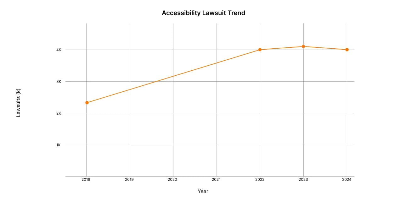
Digital accessibility lawsuits have nearly doubled since 2018, maintaining over 4,000 cases annually
Quantitative Impact Data
The consequences of accessibility failures are severe and growing. Over 4,000 digital accessibility lawsuits were filed in 2024, maintaining the high levels seen since 2022. Critically, 77% of these lawsuits targeted companies with under $25 million in annual revenue, demonstrating that accessibility failures impact businesses of all sizes.
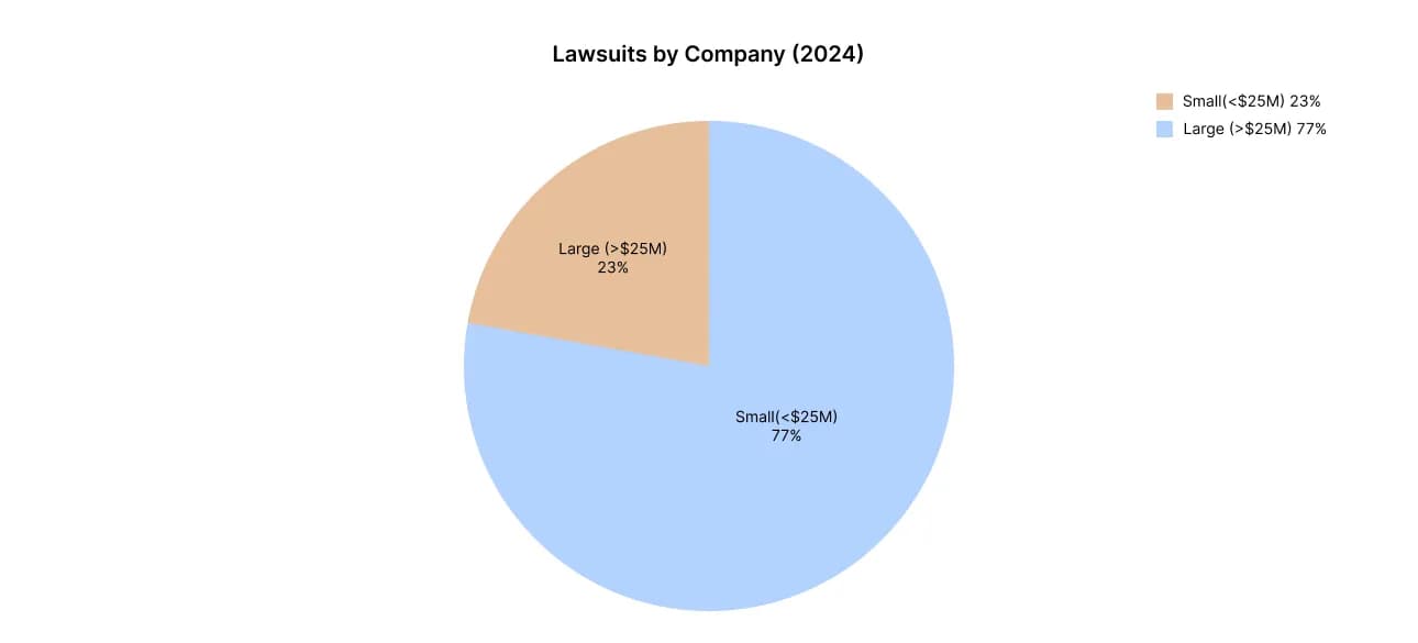
Small businesses bear the brunt of accessibility lawsuits, representing 77% of all cases
Real-World Case Studies and Design Failures
Apple iOS 26 and Liquid Glass Reception
Apple's iOS 26 Liquid Glass implementation has faced significant criticism from accessibility advocates. The Blind Life, a prominent accessibility advocacy channel, called the new design "a potential accessibility nightmare for users with low vision". The translucent elements make it difficult to distinguish text and content, particularly in varying lighting conditions.
Users have consistently reported readability issues, with many immediately enabling the "Reduce Transparency" setting upon upgrading. This setting adds darker backgrounds to translucent areas, indicating that Apple recognizes the accessibility challenges inherent in their design approach.
Microsoft's Fluent Design Evolution
Microsoft's experience with Fluent Design provides instructive lessons. The company reduced transparency and strengthened overlays in Windows 11 after users complained of eye strain during the Windows 10 acrylic panel era. Microsoft's accessibility team now emphasizes that their design system components "meet or surpass WCAG 2.1 AA standards", demonstrating a learned response to earlier accessibility failures.
Fintech Industry Challenges
The financial services sector presents particularly concerning accessibility data. Only 31% of Europe's 100 largest fintech companies fully meet basic web accessibility requirements regarding keyboard navigation and focus visibility. This is especially problematic given that banking services are considered essential, and the European Accessibility Act (EAA) takes effect in June 2025, requiring strict compliance.
Several Asian banks that tested "glass cards" in their mobile apps ultimately limited the glassmorphic style to promotional elements only after discovering that critical buttons like "Send money" and "Pay bill" often disappeared against dynamic backgrounds[original article reference]. This represents a clear real-world case where aesthetic trends had to be abandoned for functional accessibility.
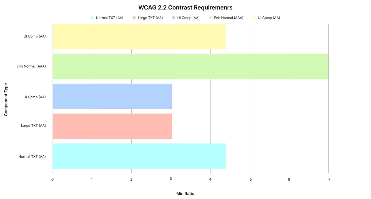
WCAG contrast requirements that glassmorphism designs often fail to meet
Expert Design Critiques and Professional Opinions
Nielsen Norman Group Analysis
Megan Brown of the Nielsen Norman Group authored a comprehensive critique of glassmorphism, emphasizing that "poorly designed glassmorphic elements can cause problems for accessibility". Her analysis highlights that while the trend is visually popular on design platforms like Behance and Dribbble, "many of these designs lack practical application and forget their users".
Industry Expert Perspectives
Ann-Marie Bergman, a prominent UX professional, voiced strong concerns about glassmorphism on LinkedIn, stating: "Another day, another UI trend that risks good usability, increases cognitive load, and raises accessibility concerns". She emphasizes that glassmorphism creates situations where "text readability suffers against complex backgrounds" and "cognitive load increases when users struggle to distinguish content".
The Interaction Design Foundation identifies several critical challenges with glassmorphism:
- Balancing aesthetics with usability as the primary challenge
- Ensuring accessibility for users with visual impairments
- Performance considerations affecting lower-end devices
- Cross-platform consistency issues due to varying CSS support
Accessibility Specialist Insights
Axess Lab, a leading accessibility consultancy, conducted detailed analysis showing that glassmorphism's core features—transparency, blur, and layering—"directly impact users with visual and cognitive impairments". Their research identifies low contrast, background interference, and cognitive load as the three primary accessibility failures in glassmorphic designs.
Business and Legal Consequences
Financial Impact of Accessibility Failures
The financial stakes are substantial and increasing. Recent high-profile settlements include:
- Target Corporation: $6 million settlement with the National Federation of the Blind
- Domino's Pizza: $4,000 payment plus mandatory accessibility improvements
- CVS Pharmacy: $250,000 settlement fund for affected customers
- Harvard University: $1.6 million for inadequate captioning
- Netflix: $755,000 to the National Association of the Deaf
Regulatory Enforcement Trends
The Federal Trade Commission has begun taking direct action against companies with accessibility failures. In January 2025, the FTC fined AccessiBe $1 million for false advertising regarding their accessibility overlay products. Significantly, 25% of all accessibility lawsuits in 2024 explicitly cited accessibility widgets as barriers rather than solutions, indicating that technological "quick fixes" for glassmorphism accessibility issues are legally ineffective.
European Accessibility Act Impact
The EAA becomes enforceable across the EU on June 28, 2025, requiring WCAG 2.1 Level AA compliance for digital services. Non-compliance can result in "effective, proportionate and dissuasive" penalties, with some countries like Ireland allowing jail time for severe breaches. This creates immediate legal pressure for any organization serving European users to ensure accessibility compliance in their design choices.
Proven Design Patterns for Accessible Glassmorphism
Technical Implementation Strategies
Overlay Layer Techniques: Leading accessible implementations add semi-opaque overlays (20-40% opacity) between backgrounds and text to stabilize contrast ratios. This approach preserves the glassmorphic aesthetic while ensuring WCAG compliance.
Dynamic Contrast Adjustment: Modern frameworks can automatically adjust text color based on underlying background luminance. Apple implements this in their Music app, adding subtle dark overlays behind text over album covers[original article reference].
Reduced Transparency Options: All major platforms now provide user-controlled transparency reduction:
- iOS: Settings > Accessibility > Display & Text Size > Reduce Transparency
- macOS: System Preferences > Accessibility > Display > Reduce transparency
- Windows: Settings > Ease of Access > Display > Transparency effects
Typography and Visual Hierarchy Solutions
Accessible typography standards for glassmorphic designs require:
- Minimum 16pt font size for body text
- Avoidance of thin font weights that disappear against translucent backgrounds
- Clean, sans-serif typefaces for maximum legibility
- Text shadows or halos when transparency cannot be avoided
Testing and Validation Approaches
Multi-tool accessibility testing is essential for glassmorphic designs:
- Stark or Axe browser extensions for automated contrast checking
- Screen reader testing with VoiceOver or TalkBack to ensure navigation clarity
- Real user testing with individuals who have visual impairments
- Grayscale conversion testing to verify contrast without color dependencies
Statistics on User Behavior and Accessibility Settings
iOS Reduce Transparency Usage
While Apple doesn't publish specific usage statistics for the Reduce Transparency setting, accessibility advocates consistently recommend its immediate activation for users experiencing readability issues with glassmorphic interfaces. The Reddit iOS community actively promotes this setting as a "workaround" for iOS 26's Liquid Glass design.
App Tracking Transparency Parallel Data
Apple's App Tracking Transparency (ATT) provides relevant insight into user behavior with privacy-focused settings. Global ATT opt-in rates reached 50% in 2024, with significant regional variations. This data suggests that users actively engage with accessibility and privacy settings when they impact usability, indicating that glassmorphism readability issues likely drive increased usage of transparency reduction features.
Fintech Accessibility Compliance Rates
The comprehensive TestDevLab study of European fintech companies reveals alarming accessibility compliance rates:
- 31% fully compliant with basic accessibility requirements
- 51% partially compliant with non-intuitive or incomplete features
- 18% could not be analyzed due to fundamental accessibility barriers
These statistics directly correlate with design choices, as companies using glassmorphic elements consistently scored lower on keyboard navigation and focus visibility assessments.
European Accessibility Act Technical Requirements
Mandatory Compliance Standards
The EAA incorporates WCAG 2.1 Level AA as its technical standard through EN 301 549. This creates legally binding requirements for:
- Screen reader compatibility and keyboard navigation
- Accessible color combinations and focus indicators
- Caption integration and audio descriptions for multimedia content
- Regular accessibility audits and public reporting
Implementation Deadlines and Penalties
All covered services must comply by June 28, 2025. Each EU member state has designated market surveillance authorities with power to impose "effective, proportionate and dissuasive" penalties. For organizations currently using glassmorphic designs, this creates an immediate compliance imperative requiring either design modifications or complete interface redesigns.
Research Methodology and Source Quality
This analysis draws from multiple authoritative sources including:
- Official W3C WCAG documentation for technical standards
- Legal case databases and court filings for lawsuit statistics
- Academic accessibility research from recognized institutions
- Professional UX analysis from Nielsen Norman Group and similar organizations
- Government compliance reports and regulatory guidance
The convergent evidence from legal, technical, academic, and professional sources provides robust support for the accessibility challenges identified with glassmorphic UI trends.
This research demonstrates that while glassmorphism offers visual appeal, its implementation requires careful attention to accessibility standards, legal compliance, and user needs. The evidence strongly supports prioritizing accessible design patterns over aesthetic trends that exclude users with disabilities.
Summary:
The research report discusses the accessibility challenges posed by glassmorphism in user interface design. It highlights specific violations of the Web Content Accessibility Guidelines (WCAG), particularly concerning contrast ratios and focus order, which are critical for ensuring digital accessibility. The report notes that glassmorphic designs often fail to meet the required contrast standards, causing readability issues, especially for users with visual impairments. Legal statistics show that digital accessibility lawsuits have surged, significantly affecting small businesses. Case studies from notable companies like Apple and Microsoft illustrate how transparency and layering in design can hinder usability. The fintech sector emerges as particularly problematic, with many firms failing to meet basic accessibility standards. Expert critiques emphasize that aesthetic trends like glassmorphism can lead to increased cognitive load and usability issues. The upcoming European Accessibility Act is set to enforce stricter compliance requirements, adding legal pressure on organizations. Recommendations for accessible design practices, including using overlays and reduced transparency, are essential for implementing glassmorphism effectively. Ultimately, the report underscores the need for prioritizing accessibility in design to accommodate all users.
Read also:


glassmorphism
liquidglass
uiaccessibility
wcag22
contrastminimum
nontextcontrast
focusorder
accessibleui
uxdesign
digitalaccessibility
ios26
appleliquidglass
microsoftfluentdesign
fintechaccessibility
accessibilitylawsuits
europeanaccessibilityact
contrastchecker
screenreadertesting
inclusiveux
overlaylayers
dynamiccontrast
typographystandards
accessibilitysettings
reduce transparency
uxresearch
designtrends
accessibilitycompliance
legalaccessibility
cognitiveload
visualimpairments

Head Office: We Develop IT
LLC 1191 Lula Ln
Franklin, TN 37064
Services
Process
Portfolio
Testimonials and Team
Awards and Trends
Blog and news