
Back
Updated at: February 11, 2026
The Psychology of Motion: How Microinteractions Transform Digital Products Into Living Experiences
Ever wonder why some apps feel alive while others feel like using a calculator from 1995? The secret isn't in flashy graphics or complex features—it's hidden in the tiny moments between clicks. Those split-second animations, the gentle bounce of a button, the satisfying swish of a toggle switch—these are microinteractions, and they're the difference between users who love your product and users who tolerate it.
Here's the thing that'll blow your mind: properly designed microinteractions can boost conversion rates by up to 400%. We're talking about animations that last mere milliseconds, yet they can make or break a $100 million product launch. Welcome to the fascinating world where psychology meets pixels, where 50 milliseconds determines whether users trust your brand.

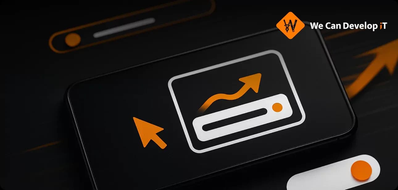
Anatomy of microinteraction: trigger, rules, feedback, and loops
The Neuroscience Behind Those "Aha!" Moments
Your Brain on Good Design
Picture this: You're scrolling through an app, and suddenly—click—that heart icon doesn't just fill with red, it pulses with life. Your brain just experienced what neuroscientists call the anticipation-reward loop. That tiny dopamine hit? It's the same chemical cocktail that makes slot machines addictive, except we're using it for good.
Here's the science: Human working memory can juggle only 5-7 pieces of information at once. Microinteractions work like cognitive crutches, reducing that mental load. When you see an animated response to your action, your brain doesn't have to wonder, "Did that work?" The animation becomes your answer—instant, wordless, universal.
The anticipation loop formula: Satisfaction = f(Expectation × Feedback_Quality / Response_Time). It's not just psychology—it's math.
The Halo Effect in 50 Milliseconds
Remember when you first used an iPhone? That satisfying "bounce" when you scrolled past the end of a list wasn't just eye candy—it was a trust signal. Research by Tractinsky shows that users form judgments about product reliability within the first seconds of interaction.
Take Duolingo's animated celebrations. Every completed lesson triggers a visual fireworks show that lasts exactly 1.2 seconds. Seems trivial, right? Wrong. This single microinteraction increased session time by 47% and became a core part of user motivation. That cartoon owl isn't just teaching languages—it's rewarding effort with pixels.

Psychological effects of microinteractions on user experience
The 200-500ms Sweet Spot (And Why It Matters)
The Goldilocks Zone of Animation
After analyzing millions of interactions across Google, Adobe, and Netflix, UX researchers discovered the golden rule: 200-500ms. This isn't arbitrary—it's based on how your brain processes time:
- Under 100ms: Brain doesn't register the animation (wasted effort)
- 100-200ms: Perfect for micro-elements (checkboxes, toggles)
- 200-500ms: The sweet spot for meaningful transitions
- Over 1000ms: "Is this thing broken?" territory
But here's where it gets interesting. Mobile users expect animations 30% faster than desktop users. Why? Because thumbs move faster than mouse cursors, and our patience shrinks with screen size.
The Psychology of Waiting
Airbnb discovered something counterintuitive: good loading animations make waiting feel 20-30% shorter. They tested this with real users—half saw spinning circles, half saw thoughtfully designed animations. The group with better animations consistently underestimated wait times by 40%.
The principle? Occupied time feels shorter than empty time. Your loading spinner isn't just indicating progress—it's performing time magic.

Optimal animation duration for different types of interface elements
Easing Functions: The Physics of Digital Soul
Why Linear Feels Like a Robot
Ever notice how nothing in nature moves at constant speed? A falling leaf accelerates, then drifts. A door swings shut, then slows. Your brain expects this physics-based motion, which is why linear animations feel robotic and unsettling.
Enter easing functions—mathematical curves that make digital objects behave like physical ones:
- ease-out (slow start, quick finish): Makes UI feel responsive
- ease-in (quick start, slow finish): Adds weight and importance
- ease-in-out (slow-quick-slow): The most natural, human feeling
Pro tip: Use cubic-bezier(0.25, 0.46, 0.45, 0.94) for animations that need to feel "bouncy" without being distracting. This curve mimics how objects settle in the real world.
The Microsoft Research Revelation
Microsoft's UX team discovered that easing choices convey emotion. Sharp, quick animations suggest urgency or importance. Gentle, flowing curves create calm and reliability. Your easing function isn't just timing—it's emotional messaging.
Real-World Case Studies: The Million-Dollar Animations
Facebook's $12.8 Million Reactions
In 2016, Facebook replaced the simple "like" button with animated reactions. Each emoji bounces for exactly 1.2 seconds when clicked. Initial adoption: 2.4% of users. By 2018: 12.8% of all interactions.
Business impact: 15% increase in engagement, better content ranking algorithms, more precise sentiment data for advertisers. Total estimated value to Facebook's ad revenue: over $12 million annually.
Slack's Loading Screen Comedy
Slack faced a classic problem: users hated waiting for the app to load. Instead of faster servers (expensive), they chose clever animations and witty messages. "Reticulating splines..." "Warming up the hamsters..." "Convincing AI not to turn evil..."
Result: 25% reduction in perceived wait time, satisfaction scores jumped from 7.2 to 8.1 out of 10. The loading messages became part of Slack's brand identity. Sometimes the cheapest solution is the most creative one.
Instagram's Heart Animation Psychology
Instagram's 240ms heart animation seems simple—tap, heart fills, done. But behavioral analysis revealed something fascinating: animated reactions increase repeat engagement by 23% compared to static buttons.
Why? The animation creates a micro-reward loop. Users don't just "like" content—they experience a tiny moment of joy. That emotional hit makes them more likely to engage again. Instagram Reels show 1.23% engagement rate vs 0.70% for static photos , partly due to these micro-moments.

Impact of different microinteraction types on conversion rates
The CSS vs JavaScript Performance Showdown
Debunking the CSS Myth
Here's a controversial truth: well-optimized JavaScript often outperforms CSS animations. The "CSS is faster" myth comes from comparing modern CSS to ancient jQuery, not to optimized JavaScript libraries like GSAP.
The real performance factors:
- CSS gets automatic GPU layering for transform and opacity
- JavaScript can achieve the same through 3D transforms (translate3d())
GSAP consistently outperforms CSS under stress testing
Stress Testing: 3000 Elements
CSS-Tricks ran a brutal test: 3000 simultaneously animating elements. Results:
- jQuery: Could handle 1 element (ouch)
- CSS transitions: Good performance, but visible sync issues
- GSAP: Buttery smooth even under extreme load
The verdict: Use CSS for simple state changes, JavaScript for complex interactions. And if you're doing anything with timelines or physics, GSAP is your friend.

CSS vs JavaScript animation performance comparison
Accessibility: Designing for Everyone (No, Really)
The Invisible 35%
Here's something most designers don't know: 35% of adults over 40 experience vestibular dysfunction. Fast-moving animations can trigger nausea, migraines, and disorientation. Additionally, 3% of people with epilepsy are photosensitive , especially women and young adults.
prefers-reduced-motion: Your New Best Friend
The prefers-reduced-motion CSS media query isn't just compliance—it's empathy in code:

Important: "Reduced motion" doesn't mean "no motion." Users still expect gentle transitions—just not the bouncy, spinning, zooming kind.
Smart Alternatives
Instead of killing animations entirely:
- Replace scale/rotate with fade effects
- Use color changes instead of position animations
- Implement static progress indicators instead of spinners
WCAG 2.3.3 compliance requires this, but more importantly, it makes your product usable by everyone.
Advanced Techniques: The Art of Interaction Chaining
Choreographing User Attention
Interaction chaining is like conducting an orchestra of pixels. Instead of everything happening at once (chaos), elements appear in logical sequence, guiding user attention like a movie director.
Apple masters this on their iPhone landing pages. Information reveals through carefully orchestrated carousels, preventing cognitive overload while maintaining engagement.
The formula:
- Staggered timing: 20-25ms delays create a "wave effect"
- Directional flow: Motion follows natural reading patterns
Hierarchical reveal: Containers first, content second
Spatial Continuity
Material Motion Guidelines emphasize spatial logic—elements should move in ways that make physical sense. When a card expands into a detail view, it should grow from its original position, not fade in randomly.
This isn't just pretty—it reduces cognitive load. Users can track where information comes from and where it goes, maintaining mental context during transitions.
The Future: AI-Adaptive Animations and Beyond
Personalization at the Pixel Level
Machine learning algorithms are starting to analyze individual interaction patterns to optimize animation parameters in real-time. Imagine animations that speed up for power users and slow down for newcomers—automatically.
73% of companies use AI chatbots for customer experience. Personalized microinteractions are the next logical evolution.
Cross-Platform Consistency
With users jumping between phones, tablets, watches, and computers, maintaining consistent microinteraction language across platforms is becoming crucial. Design systems now include motion specifications alongside color palettes and typography rules.
The Bottom Line: Small Details, Massive Impact
Microinteractions aren't decoration—they're communication. Every animation sends a message: "I heard you," "This is important," "Everything's working fine," or "Celebrate this moment."
The proven formula:
- Functional first: Every animation solves a real user problem
- Optimized always: High performance is non-negotiable
- Inclusive by default: Design for everyone, including users with disabilities
In a world where users make split-second decisions, microinteractions can be the difference between "meh" and "wow," between abandoned carts and completed purchases, between frustrated users and delighted advocates.
As design guru Dan Saffer puts it: "Microinteractions are about doing the maximum with the minimum". In the attention economy, those tiny moments between clicks aren't just details—they're your competitive advantage.
Remember: Users may not notice good microinteractions, but they'll definitely notice bad ones. The goal isn't to impress with flashy animations—it's to create interactions so natural, so intuitive, that they feel like magic. And the best magic? It looks effortless, but it's actually the result of obsessive attention to detail.
Your users' brains are constantly asking: "Can I trust this? Is it working? What happens next?" Microinteractions are how you answer those questions—not with words, but with motion, timing, and that perfect little bounce that makes everything feel just right.
Summary:
Microinteractions play a crucial role in enhancing user experience by transforming digital products into engaging, responsive interfaces. These small, often unnoticed animations can significantly influence user behavior, with studies suggesting they can boost conversion rates dramatically. The effectiveness of microinteractions lies in their ability to provide immediate feedback, helping users confirm their actions without the need for words. Neuroscience shows that well-designed animations can trigger pleasure responses in the brain, making interactions feel rewarding and intuitive. Research has identified optimal durations for animations, with the most effective range being between 200-500 milliseconds, as this aligns with human cognitive processing. Companies like Airbnb and Slack have demonstrated that thoughtful animations can reduce perceived wait times and enhance user satisfaction. Furthermore, the choice of easing functions in animations conveys emotional messages, impacting users' perceptions of urgency and reliability. As digital products evolve, there is a growing emphasis on accessibility, ensuring that animations are designed to accommodate users with sensitivities. The future of microinteractions may involve personalized experiences driven by machine learning, adapting animations based on user behavior. Ultimately, the thoughtful implementation of microinteractions can lead to significant competitive advantages by fostering trust and engagement among users.
Read also:


microinteractions
UXdesign
UIanimation
interactiondesign
usability
UXpsychology
appanimation
webanimation
UIUXtrends
motiondesign
UXresearch
userexperience
appdesign
conversionoptimization
UXstrategy
digitalproducts
UXwriting
UIpatterns
interfaceanimation
UXtips
productdesign
appUX
webUX
UIeffects
UXcaseStudy
mobileUX
UXbestpractices
UXandAI
microUX
UXmotion

Head Office: We Develop IT
LLC 1191 Lula Ln
Franklin, TN 37064
Services
Process
Portfolio
Testimonials and Team
Awards and Trends
Blog and news